
ORCHARD PARK, N.Y. — The most iconic aspect of the Buffalo Bills is celebrating its golden anniversary.
What aspect you may ask?
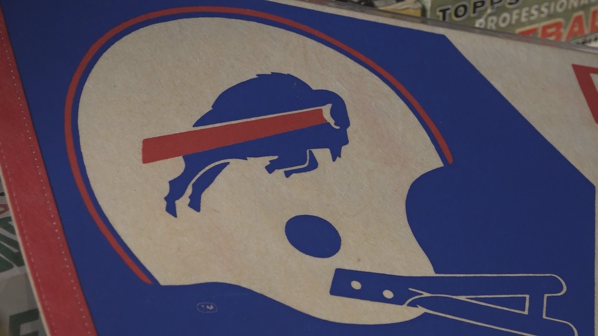
Why the team's current logo of course; the Charging Bison or Buffalo, depending on who you ask debuted 50 years ago.
The logo is iconic, representing not just a team but a fan base: Bills Mafia. It debuted back on July 27, 1974, at the Hall of Fame game in Canton, Ohio.
The Bills had just finished their first winning season since 1966, and according to sports historian Greg Tranter, they wanted something new.
“Buffalo the team was looking for a more modern look. There was this looking forward, moving forward, we want to be progressive,” Tranter said.
The league tapped Long Beach, California-based illustrator Stevens Wright, and after at least one tweak, Tranter explained, elongating the swoosh to make it look like the logo was taking off, the Charging Buffalo was born.
It’s not the oldest logo in the NFL with original teams like the Packers and the Steelers claiming that title, but having been unchanged for 50 years now, it’s in the top half.
The logo marked a new era, Tranter said.
“The logos really started being merchandisable, and I think it's a pretty iconic logo, and it's an attractive logo, and it's stood the test of time for that,” said Tranter, a Bills season ticket holder for 40 years.
The logo and its history have been preserved by folks like Tranter and John Boutet, a curator.
“The Buffalo Sports Hall of Fame, that's what we call it,” Boutet said.
And collector.
“Basically, this is my basement,” he said.
But this is no average or even above average sports basement.
From floor to ceiling there are showcases and displays, pennants, tickets, and programs that tell the history of the Buffalo Bills, like where they got their name.
Boutet explained that the Buffalo Bills and their early imagery start with Buffalo Bill Cody, a cowboy and Bison hunter.
Fast forward a few decades, when the American Football League started in the early '60s the Buffalo Bills looked a lot different than the ones we know today.
Their uniforms were a simple silver and royal blue, connecting Ralph C. Wilson to his old team, the Detroit Lions.
“And they didn't have an official logo on the helmet. This was kind of popular in the day not a lot of teams in collegiate or professional used a logo they just used the numerals on the side,” Boutet said.
Their unofficial logo featured two bison and two players inside a football for many years. It was switched in 1962, to one of each bison and player until 1969.
In 1970 came the red standing bison.
“You think of OJ Simpson, Joe Ferguson, Ahmad Rashad, Bob Chandler from that time,” Boutet said.
“I think when they had that idea that they wanted to show motion they wanted to show force they came up with a great logo. The guy who did it Stevens Wright he really had it right,” he added.
Wright would go on to redesign a few more NFL logos including the Patriots and 49ers although ...
“They never used them, so this was really the only one, the Bills logo was the only one that he did that they ultimately used,” sports historian Greg Trantor explained.
“You could be anywhere in the world and if you see anyone with a Bills logo you go, ‘Go Bills’ right away… and it looks like it's going to be around for a lot longer,” Boutet said.
So after 50 years, it’s safe to say Wright got it right the first time, when he created the Buffalo Bills Charging Bison … or Buffalo.